The <dialog> element
I think we can all agree: Modals from scratch are a pain. Before, you had to write custom HTML, fiddle with position: fixed, wire up JavaScript for focus trapping, and generally do a lot of magic to make it even remotely accessible. But with the arrival of the dialog element in Baseline, some of this got a lot easier.
Today, we will look at that native HTML <dialog> element and explore how you get accessible modals for free.
The Basic <dialog>
The HTML element is not visible by default, similar to a shy colleague. You just put it in your HTML, and the browser knows to hide it until you explicitly say otherwise.
<style>
    body {
        background-color: white; /*shows backdrop better*/
    }
</style>
<dialog id="my-confirmation-dialog">
  <h2>Are you certain, friend?</h2>
  <form method="dialog">
    <button value="cancel">No, I'm scared</button>
    <button value="confirm" autofocus>Yes, go!</button>
  </form>
</dialog>
<button onclick="document.getElementById('my-confirmation-dialog').showModal()">
  Show Confirmation
</button>
<div>
    <h2>Dialog Result</h2>
    <span id="result-display">-</span>
</div>
<script>
    const dia = document.getElementById("my-confirmation-dialog");
    dia.addEventListener("close", (ev) => {
        document.getElementById("result-display").innerText = ev.target.returnValue;
    })
</script>
As you see above, you can use a button to call the dialog to life. The <form method="dialog"> part is nifty, as it tells the browser to automatically close the dialog when the form is submitted. The button's returnValue is then the value of the dialog and can, for instance, be read during the close event handler as shown above.
show() versus showModal()
The most important distinction to know is how you open the dialog, as this changes its behavior fundamentally. There are two main methods on the element: .show() and .showModal().
If you want a floating window that does not block interaction with the rest of the page (like a quick hint or a small non-critical notification) you use .show(). In this non-modal state, the rest of the document is still fully interactive, and the dialog does not come with the automatic "shadow curtain" background. It also does not close when the user presses the Esc key.
If you want the whole webpage to become inert, blocking the user until they deal with the dialog, you should use the .showModal() method. For that purpose, showModal() does a lot of heavy lifting for you:
- It automatically places the dialog in the top layer, giving it the highest stacking context.
- It makes everything else outside the dialog inert (not clickable, not focusable).
- It traps the keyboard focus inside the dialog itself.
- It lets the user close the dialog using the
Esckey.
You should always use showModal() when the user must make a choice that needs immediate attention. As with normal modal dialogs.
Styling the ::backdrop
When you call showModal(), the browser generates a kind of semi-transparent shadow curtain behind the dialog box. This is called the backdrop. What is so great is that you can style this backdrop using the ::backdrop CSS pseudo-element.
<style>
    body {
        background-color: white; /*shows backdrop better*/
    }
    dialog::backdrop {
        background: rgb(255 0 0 / 0.7);
        backdrop-filter: blur(4px);
    }
    #my-green-dialog::backdrop {
        background: rgb(0 255 0 / 0.7);
    }
</style>
<dialog id="my-confirmation-dialog">
  <h2>Are you certain, friend?</h2>
  <form method="dialog">
    <button autofocus>Yes, go!</button>
  </form>
</dialog>
<dialog id="my-green-dialog">
  <h2>Are you jealous?</h2>
  <form method="dialog">
    <button autofocus>...yes!</button>
  </form>
</dialog>
<button onclick="document.getElementById('my-confirmation-dialog').showModal()">
  Show Red Confirmation
</button>
<button onclick="document.getElementById('my-green-dialog').showModal()">
  Show Green Confirmation
</button>
This way, you can create a beautiful, custom backdrop that signals to the user that the rest of the page is currently unavailable. Also, you can have multiple backdrops defined. This is very important for accessibility and a good user experience!
Browser support
A quick browser support overview as of 2024-06-12.
The element is widely supported in modern browsers. It's been available across browsers since March 2022. All the major browsers now support the <dialog> element.
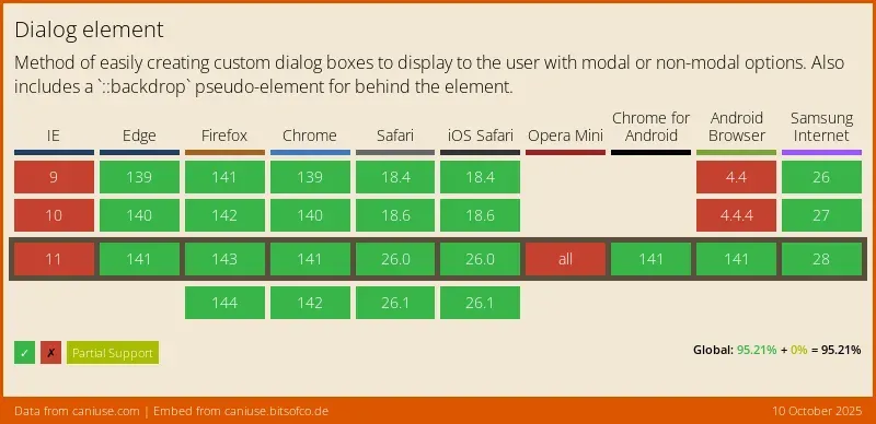
I would say you're good to go.
Conclusion
The native HTML <dialog> element is a huge leap forward in making web development easier and, more importantly, more accessible by default.