Modern Responsive Toolkit: env()
Welcome to part 2 of the Modern Responsive Toolkit series. With the prevalence of modern browsers, the number of tools available to frontend developers has increased dramatically. Today, we will discuss the env() function.
The env() function
"What on earth is the env() function?" you might ask. It's a function that works similarly to var(), but is primarily used for User-Agent defined variables, as specified. For example, if you want to add padding around your body to position it in the safe-area on non-rectangular displays, you could use the following code:
body {
  padding-top: env(safe-area-inset-top, 0);
  padding-right: env(safe-area-inset-right, 0);
  padding-bottom: env(safe-area-inset-bottom);
  padding-left: env(safe-area-inset-left, 0);
}
Possible Values
Here's a quick overview of the possible values as of April 2023:
safe-area-inset-*: These environment variables define a safe area within the viewport that is free from UI elements that may obstruct content, such as notches or rounded corners. The values of these variables represent the top, right, bottom, and left insets from the edge of the viewport.titlebar-area-*: These environment variables are used in the context of Progressive Web Apps (PWAs) on desktop devices. They define the area on the screen that is reserved for the titlebar and window controls, such as minimize and close buttons.keyboard-inset-*: These environment variables provide information about the on-screen virtual keyboard's appearance. They define the size of the area that is occupied by the keyboard and the position of the keyboard in relation to the viewport.
An Example
A few years ago, I developed my own end-to-end encrypted note-taking system based on CouchDB and client-side indexing. The project is just for me, so I didn't have to test it on devices I don't use. To facilitate mobile access, I added a bottom navigation bar. This setup worked without issue on Android, but when I recently switched to an iPhone, I encountered a problem: the "Home Indicator."

As far as I can tell, this issue mainly occurs in PWAs, as Safari shows a bottom navigation bar on its own. To fix this issue, I utilized the safe-area-inset-bottom environment variable.
.pb-safe {
    padding-bottom: env(safe-area-inset-bottom, 0);
  }
However, this picture does not illustrate that the padding also avoids the rounded corners of the iPhone X and later models, which is why it is so large. Nonetheless, I can now use my bottom navigation without issues. If this were not just a private app but something for clients, I would attempt to make it look more visually appealing, perhaps similar to the browser controls themselves (i.e., utilizing the full width of the screen).
Browser support
A quick browser support overview as of 2023-04-15.
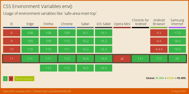
So, if you don't need to support IE or older Evergreens, I would say you're good to go.
Conclusion
With env() in your toolkit, you can dynamically respond to the constantly changing array of consumer devices. Your web app will be usable on everything from an Apple Watch to a Samsung fridge. For some additional reading I can, as always, recommend the respective MDN page.