Modern Responsive Toolkit: clamp()
Welcome to part 1 of n of the Modern Responsive Toolkit series. With the takeover of modern browsers, the number of tools available to frontend developers has increased dramatically. Someday, I may write an article about the old days, but today is not that day. In this (hopefully) series, we will discuss one of the most crucial new tools: clamp().
The clamp() function
How does clamp() work? It takes three inputs: a minimum value, the dynamic value to be applied and a maximum value. The value is then clamped between the minimum and maximum values.
h1 {
  font-size: clamp(1.5rem, 1rem + 5vw, 4rem);
}
This is a basic test
In this example, the font size changes as the viewport size changes. You can simulate this by either changing your browser size or resizing the demo frame. This can have a pleasant effect on larger screens and make it easier to read on smaller screens without having to declare breakpoints.
You can also perform arithmetic operation, similar to calc(), within clamp().
.type {
  font-size: clamp(12px, 10 * (1vw + 1vh) / 2, 100px);
}
By the way, you should not use px units for font-size. They are not accessible, which means that the root font-size, which users can change in the browser, does not affect them. Always use rem units for font sizes. You can use em units, but there are pitfalls to be aware of.
It's worth noting that clamp() can also be used with other numeric values, such as frequency and angles, according to the spec.
clamp() for font-size
You might expect me to recommend using clamp() for all fonts, all the time, in all projects, but that's not the case. There are significant accessibility concerns, even when using rem in clamp(), as pointed out by Adrian Roselli in his excellent article on the topic.
If you use fluid typography, only do so in projects where accessibility is not a concern, which is almost none of them. If your client insists on using fluid typography, then be sure to thoroughly test it.
clamp() for other uses
While there are accessibility concerns with font sizing, you are relatively safe when using clamp() for other properties, such as padding or gaps.
.wrapper {
  display: flex;
  flex-flow: wrap row;
  gap: clamp(0.5rem, 2vw, 24px);
}
.card {
  counter-increment: card;
  min-width: 10rem;
  background-color: white;
  border-radius: 0.3rem;
  min-height: 5rem;
  position: relative;
}

.card::after {
  content: counter(card);
  position: absolute;
  font-size: 2rem;
  font-family: sans-serif;
  top: 50%;
  left: 50%;
  transform: translate(-50%, -50%);
}
Using clamp() for gaps or padding can help make them more aesthetically pleasing on smaller viewports and create more room for your content. At the same time, you won't lose ridiculous amounts of space on larger viewports, thanks to the maximum value constraint.
Browser support
A quick browser support overview as of 2023-03-25.
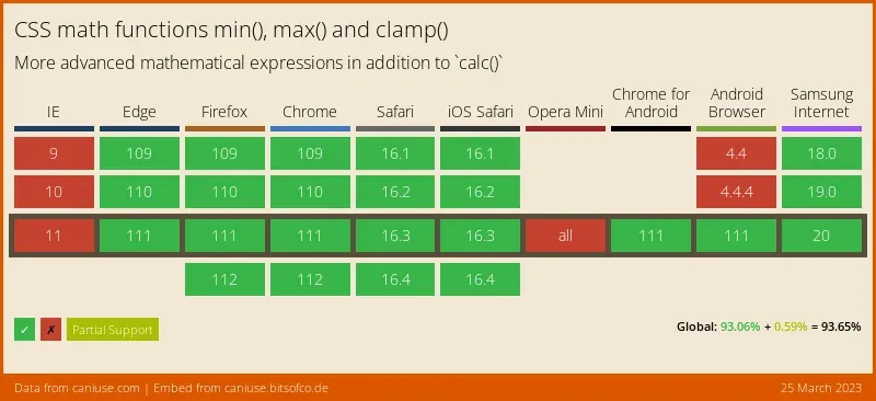
So, if you don't need to support IE or older Evergreens, I would say you're good to go.
Conclusion
With clamp() in your toolkit, you have another option for managing space issues in modern responsive design. While you need to be careful with fonts, you can use it to dynamically adjust spacing for non-text elements using, for example, padding and gaps.